
Ozmen Extra (Retail Print & In-Store Design)
Ozmen Extra
(Retail Print & In-Store Design)
The Idea
Design a clear, consistent in-store print system for a
busy international food retailer.
The goal was to help customers quickly
understand prices and promotions in a high-traffic
supermarket environment.
The Approach
I focused on strong visual hierarchy, prioritising price and
product clarity over decoration.
Layouts were kept simple and modular
so they could scale across multiple
formats and weekly promotions while remaining
easy to maintain.
The Idea
Design a clear, consistent in-store print system for a
busy international food retailer.
The goal was to help customers quickly
understand prices and promotions in a high-traffic
supermarket environment.
The Challenge
Customers needed to scan prices and offers quickly
while moving through aisles. Promotions changed frequently,
requiring designs that could be updated fast without errors.
Print materials had to remain clear and consistent across posters,
shelf labels, and catalogues.
The Approach
I focused on strong visual hierarchy, prioritising price
and product clarity over decoration.
Layouts were kept simple and modular
so they could scale across multiple
formats and weekly promotions while remaining
easy to maintain.


Tools Used
Illustrator · Photoshop · InDesign
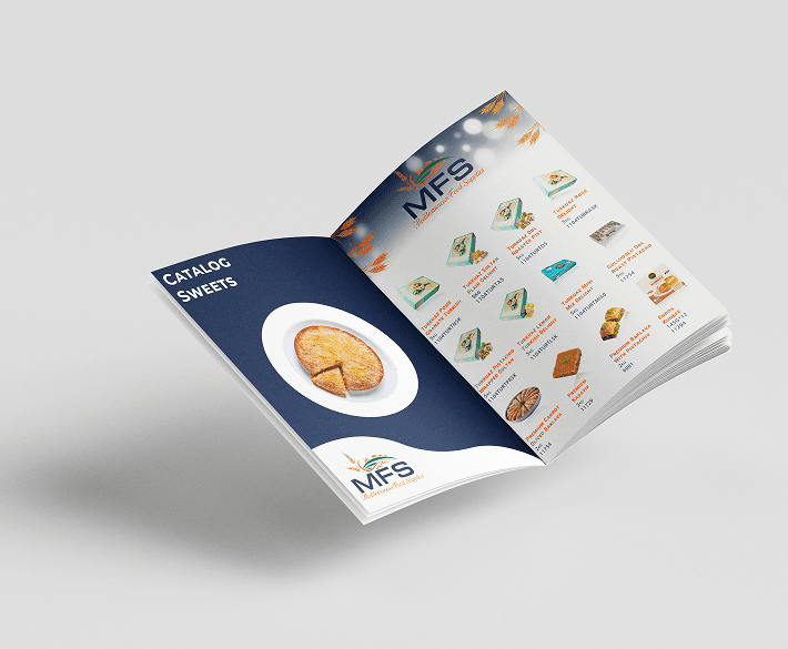
Created promotional brochures for seasonal offers in a high-traffic supermarket environment.
Focused on clear pricing, product grouping, and easy scanning for customers in-store.
Typography
Primary Font - Roboto
Secondary Font - Poppins
Created promotional brochures for seasonal offers in a high-traffic supermarket environment.
Focused on clear pricing, product grouping, and easy scanning for customers in-store.
Helped support sales promotions and reduced confusion during busy periods.
Typography
Primary Font - Roboto
Secondary Font - Poppins


#C1170E
#E5DEE0
#EE5404
Final Shop Floor Concept with Clear pricing
and more product focus
I used geometric shapes as a quiet supporting element — not decoration.
They add depth and structure, but because the colours are neutral, they don’t fight the content. The goal was clarity first.
Early Shop Floor Poster Concept
Early Shop Floor Poster Concept


Final Shop Floor Concept with Clear pricing and more product focus
These posters were created to support daily promotions and seasonal campaigns in-store.
My focus was on clear product grouping and hierarchy, ensuring customers could quickly understand offers without staff assistance.
Final shelf labels were standardised to ensure price clarity
Final shelf labels were standardised to
ensure price clarity


More Work
Illustrations